
Client Work
US LEGAL PRO
ROLE
UX design, content strategy
TIMEFRAME
3 weeks
The Challenge
US Legal Pro is a service based in Texas that e-files petitions for divorce. The service allows people to fill out the application directly on the site and files the form with the courts upon submission. The founder of US Legal Pro noticed several drop off points throughout his service and also received many inquiries via his contact page (“Is this fake?” “Are you guys real?”). US Legal Pro tasked my design team to find out why.
The Approach
Our design team conducted user interviews and usability testing with US Legal Pro customers as well as individuals who filed for divorce through a different means to understand their needs and how their emotions affected their experience. We learned that there were three key opportunities US Legal Pro was lacking at different touch points of their service:
Establishing credibility on the landing page.
Providing education of the filing process during the application.
Giving reassurance at the confirmation stage.
The Solution
Through a combination of usability testing, analyzing competitors, and researching common design patterns we were able to come up with a solution that addressed all three key opportunities. Key features included qualifying questions on the landing page, a navigation panel, and informational pop ups throughout the application.


Want a more in-depth look? Read on for the full story.
When I first received the brief, I was doubtful. No one in my immediate family or friend group had gone through a divorce. I was unsure of how I could empathize with a user base that experienced what I could only imagine to be an emotionally complicated time in their lives. And further, how could I get them to openly talk about it with me.
Understanding the Users
Based off our discussions with the clients and our own team assumptions, in order to get the most honest insights we needed to be aware of the sensitive nature of the subject. With this in mind, we were very attentive with the language and organization of our interview questions. I outlined our research goals, client assumptions, and team assumptions in our research plan and my team and I used it as a reference point to frame questions around what we needed to know.
We spoke to seven divorcees: three who filed uncontested through US Legal Pro, three who filed contested through an attorney, and one who filed uncontested at the courthouse.

During our research, it was important for us to understand how the user's emotions impacts their interaction with the service.
We organized information from our interviews and noticed patterns:
US Legal Pro attracts independent users
Those who e-filed turned to Google to research services whereas those who didn’t file online usually turned to their friends and family for recommendations.
“I just Googled ‘How to handle it all on your own’... I’m more of a do it yourself kind of person.”
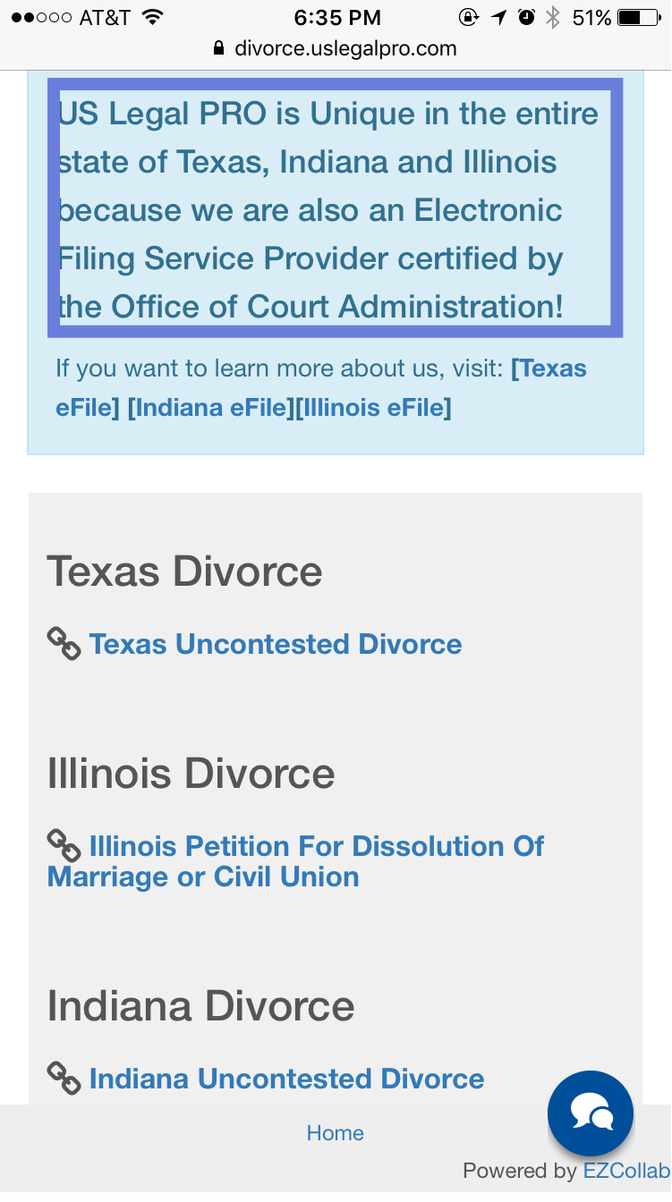
A lack of transparency hurt US Legal Pro’s credibility
Users expressed hesitation with the site because it lacked information on the landing page about US Legal Pro. In fact, many current users said their point of commitment was only after they received a phone call from its customer representatives. Users needed to know there were real people behind the curtain before committing to the service.
“I wanted to know who they were and I don’t think they answered that question.”
Users needed to be educated about the process... to an extent
Users only needed to know information pertinent to them. However, they still wanted to get through the process as quickly as possible. US Legal Pro needed to find a balance between providing information users valued yet not overwhelming them with content.
“Things I felt affected me directly I would take the time to do additional research.”
Users needed to know they're doing it right
For most users it was their first time going through the divorce filing process so naturally there was uncertainty around doing it correctly. Users needed reassurance they were taking the right steps to complete the form.
“There was nothing that gave me a sense of ease I had done it right until I got my final paperwork.”
Maintaining neutral language
Users experienced a point in their life when many emotions were present, so it was important to avoid language that triggered these emotions. Users needed to interact with a neutral platform so they could deal with whatever they felt on their own terms.
“I just needed the facts, like an instruction manual.”
Our research helped us outline three key opportunities at different stages of the process worth exploring:
CREDIBILITY at the onboarding stage
The current site’s landing page did not provide enough background about US Legal Pro to users for them to commit to the service.
The multiple calls to action makes US Legal Pro’s purpose unclear.
education of the process during the application
Complex legal terms such as ‘Waiver of Service’ are not given additional context.
Users must research these terms on their own if they need further clarification.

Reassurance at the confirmation stage
The current site’s confirmation page provides mixed messages about whether the user has completed the application correctly.
Clarification of the user’s and US Legal Pro’s next steps are not laid out.

Our research also pointed to two very distinct users.
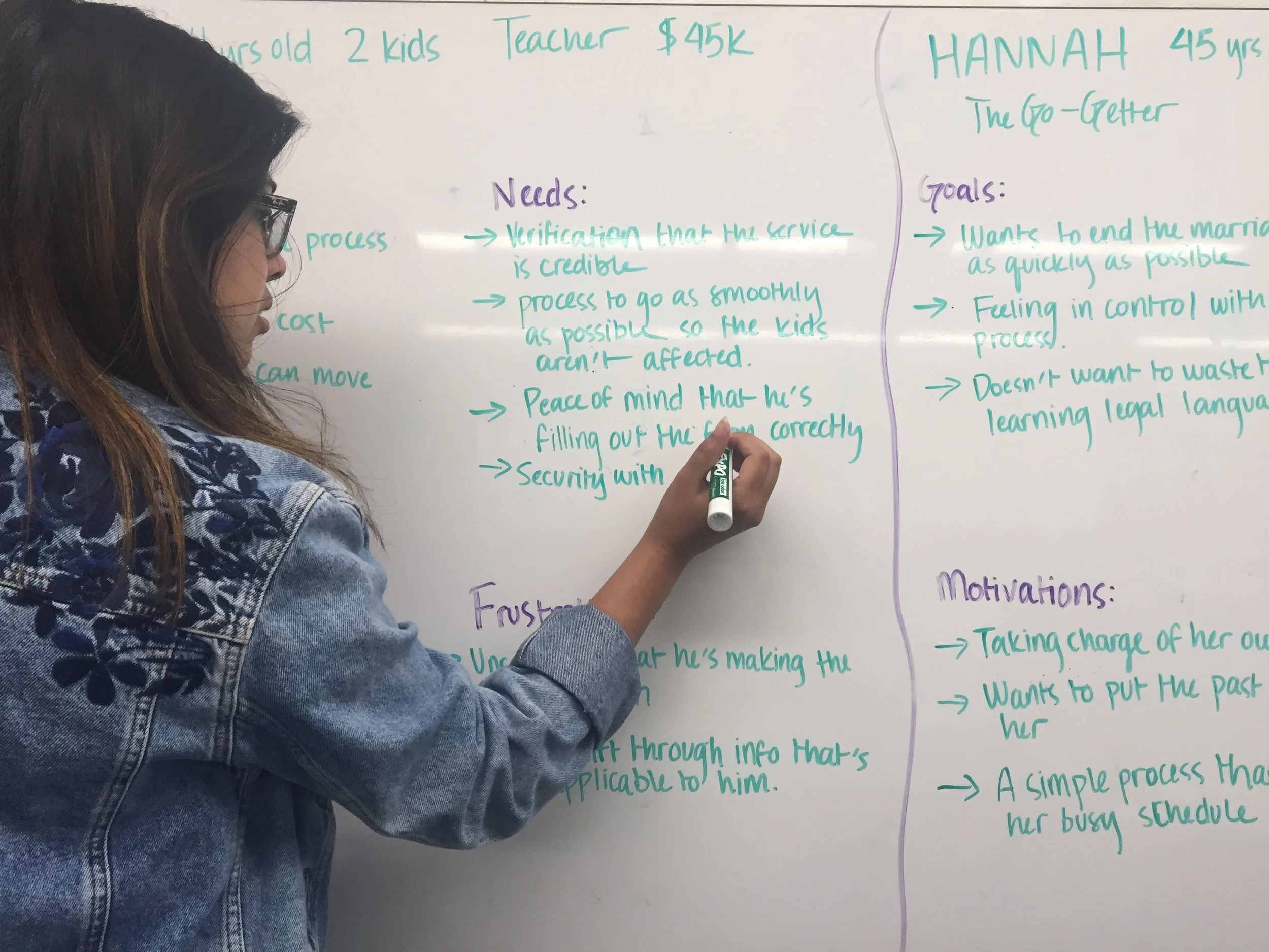
I outlined the needs, motivations, and frustrations of each distinct user so we could get a clear picture of how they differed from each other.
It turned out the key differentiator was the user’s motivations for coming to an e-filing service.

HANNAH
“I wanted to get it over with as quickly as possible.”
We saw users like Hannah. She represented a group of users who needed to put the past behind them and move onto the next chapter of their lives. She sought a service that provided a quick turnaround time and didn’t require her to do any outside research.

JACOB
“I definitely wanted to understand what I was doing.”
We also saw users like Jacob. He represented a group of users who couldn’t afford to go through a drawn-out divorce process. They were also users who needed education for the process and reassurance they filled out the forms correctly.
We discovered that although the motivators were different, our two users had one need in common: the right amount of information. This applied to every stage of the process: onboarding, the application, and the follow-up.
How can US Legal Pro build a service that provides the right amount of information so users can feel reassured they are on the right path and in control of their situation?
Guiding our Design
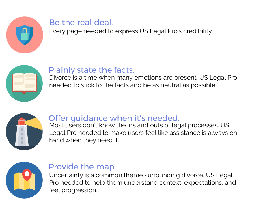
At this point, we worked under a heavy bias from the client–he wanted the site to look like “TurboTax for divorce”. As we approached concepting, it was easy to fall into the TurboTax trap and forget the valuable insights we found from our interviewees. We created the following principles to ensure we held ourselves accountable moving forward:
Exploring the Competitors
I decided a competitive analysis at our concepting phase would be useful so we could focus on how competitors were addressing the three key opportunities we identified through our research.
I compared e-filing services across three metrics:
How did competitors demonstrate credibility of their site?
How did competitors educate their users to understand complex legal jargon throughout the site?
How did competitors reassure users they accomplished everything they set out to at the end of the process?
I found similar trends across the board:
Credibility
Competitors like TurboCourt, CompleteCase, and MyDivorcePapers provided transparency about the steps involved in the process at the forefront.
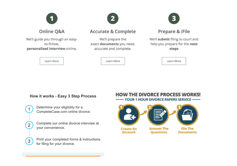
Several competitors communicated their filing process by breaking it down into three easy steps on their landing page.
Education
Competitors like GreenFiling, CompleteCase, and DivorceWriter made sure users stayed as long as possible on their sites by providing as much information as they could upfront.

Competitors offered a variety of resources such as YouTube videos and links to common questions a user may have throughout the process.
Reassurance
Competitors like GreenFiling, TurboCourt, and FilePilot provided a confirmation screen at the end outlining the next steps that needed to be taken, by the filing service or the user. They also advertised customer support throughout the process.
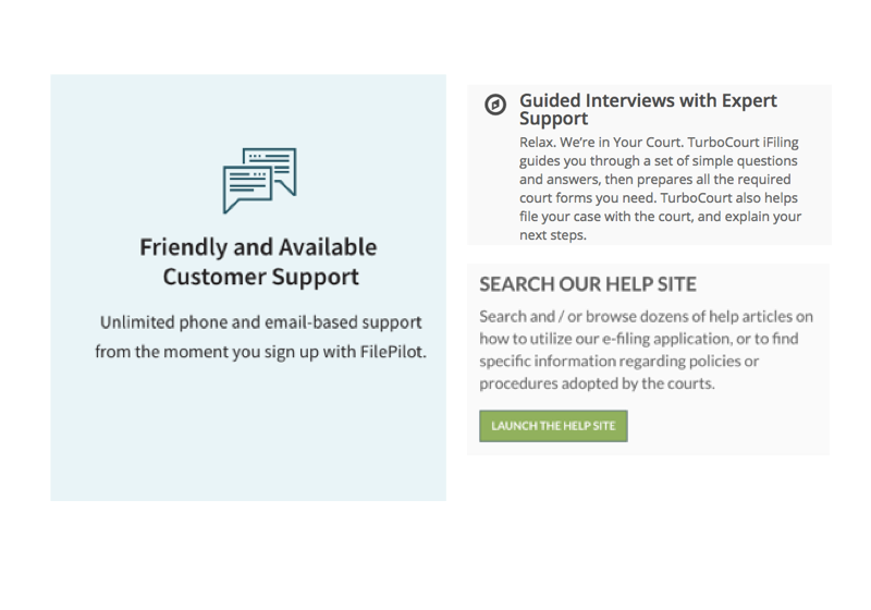
Competitors highlighted how they supported users throughout the process such as customer service and resource centers.
Implementing our Research
Our client sent us analytics showing our users were mostly navigating the site through an Android device so we focused our attentions on designing for Android.
I sketched out several ideas of how we could demonstrate the user’s needs. I took a look back at the design principles and realized one in particular offered room to explore, and which the competitive analysis hadn’t provided much insight on: “Offer guidance when it’s needed”. US Legal Pro needed to offer a good balance between providing guidance yet not overwhelming the user with content. How could we find this balance?
My teammates and I strategized on how to diverge on this question so we could get feedback on as many approaches as possible. My teammates wanted to know whether guidance should remain within the application or link out. To capture this divergence, they decided on a dropdown that provided additional context within the form field and links with brief descriptions.
I remembered users stressing the importance of communication throughout the process and how they liked being able to speak with a representative of US Legal Pro. I decided to play to the site’s strengths by creating a chat feature as the main functionality of user guidance when they needed it. I also recalled our principle “Provide the map” and wanted to find a way to help the user feel progression within the application. I came up with a dot tracker which enabled the user to have a roadmap of how many steps were in the process.
Testing our Concepts
We were excited to test out our concepts and get feedback from our users. We hoped to learn how much information was needed for each opportunity we identified during our research:
Credibility: How much and what kind of information did users need to trust the service?
Education: How much information did users need to complete the filing process? How should the information be presented to them?
Reassurance: How much guidance did users need to feel at ease about doing everything needed on their end?
Unfortunately, recruiting users for this phase was a challenge since they didn’t feel compelled to go through a simulation of filing for divorce with someone watching them. After many last-minute cancellations, we were left with feedback from only two concept tests. It was disappointing, and I was unsure of how we could move forward without collecting a substantial amount of insights. I decided the best way was to integrate other areas of our research, such as our competitive analysis and common design patterns:
Users found credibility when US Legal Pro set expectations
When the site used clearly written content about the company and the steps to expect, users were more compelled to take action.

Users needed scannable information
Users needed to be educated about the process, especially when it came to legal jargon, so they could make quick decisions and move on.
“I like the bulleted layout so I don’t have to read large chunks of information.”
Users needed to feel like they were moving forward
The dot tracker on my concept was especially well received because it allowed users to have a roadmap of where they were in the process and what steps they should anticipate.
Information in context was always helpful
This quote was taken from a user we had also spoken to in our research phase who prided herself in being independent and not needing guidance with the form. Upon seeing my design teammate’s concept with information pop-ups she admitted this and validated the feature. It indicated our independent Hannahs needed guidance even if they thought they didn’t. It was pretty cool to offer a solution to a problem our users didn’t even know they had.
“Divorce is nerve-wracking for a lot of people... if you have a lot on your mind it will help slow you down so you can make sure you’re putting the right information in.”
Finalizing the Design
With this feedback, we looked forward to returning to the drawing board and iterating on our prototype.
Since the dotted navigation bar was a feature that testers specifically found helpful, we wanted to incorporate it into the final prototype. However, this proved to be a challenge since we realized it wasn’t intuitive nor did it follow common design patterns for users to navigate the application from left to right on an Android screen. It was important to show the number of steps in the process and also give context for the steps so users felt prepared with what came next. We were unwilling to give up on either of these needs since it was something our users had consistently expressed frustration with on the current US Legal Pro site.
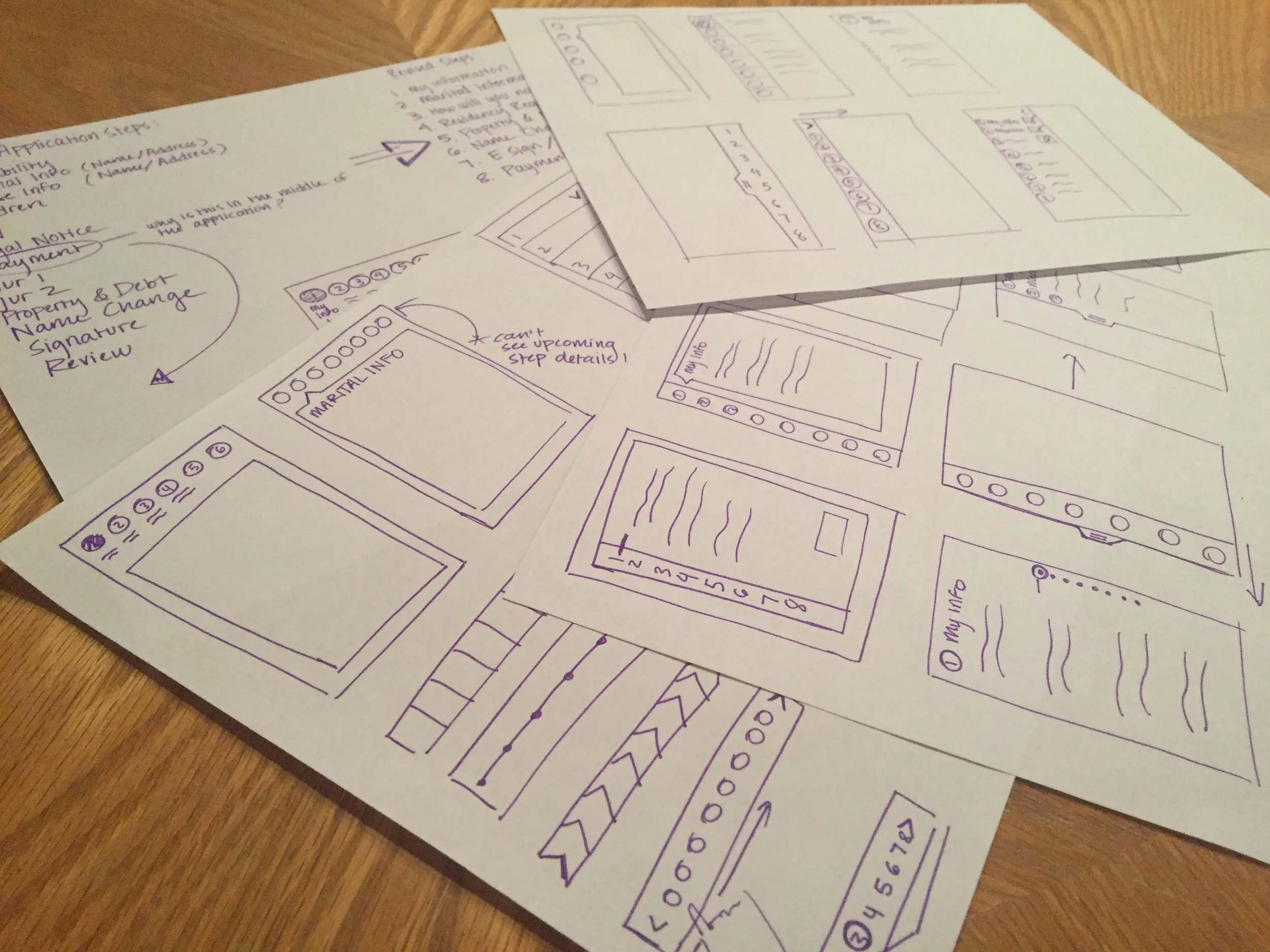
Our team brainstormed several iterations of possible navigation bars.
After sketching many possible navigation bars, we decided upon a vertical navigation panel. This allowed us not to compromise on either of the user’s needs by allowing the user to see where they were in the process at all times, while also providing them additional context of what the steps entailed so that they knew what to anticipate.
Additionally, we continued to make sure that the three identified opportunities were expressed, incorporating features that users validated through testing:
CREDIBILITY

EDUCATION

REASSURANCE

To see all of these elements working together, take a look at the final prototype:
We conducted usability tests and gained further insights on our prototype:
QUALIFYING QUESTIONS
By making the call to action “see if you qualify” we were able to communicate credibility that US Legal Pro took these applications seriously and weren’t wasting anyone’s time. This really resonated with users. Users were also able to feel in control of the process and reassured they were on the right path.
NAVIGATION BAR
Users had expressed frustration with feeling blindsided with upcoming steps since the current site offered no way of anticipating what information they needed to share. Providing a navigation bar that was always visible helped the user to anticipate what information was needed from them.
INFORMATIONAL POP UPS
Users provided further validation that they liked not having to leave the application to research terms.
Conclusion
In the end, the client really appreciated the final result. Specifically, he looked forward to implementing our solution for the landing page and demonstrating credibility with offering the qualifying questions upfront. He was also happy that we indirectly solved his problem with those qualifying questions because he admitted difficulty with keeping track of qualified applicants and unqualified applicants. The client admitted he foresaw the vertical navigation bar taking time to implement from a development standpoint, but also understood the research behind this decision.
There are still many functionalities I wanted to explore if I had more time. Throughout our research, I was able to understand the overwhelming nature of the divorce process and the emotions that came along. I continuously worked towards making all elements of the site in-house so US Legal Pro could mitigate the confusion users dealt with and be the only resource needed for the application. A few of the following features could help us get there:
A save functionality
Although most users initially felt confident they could complete the form in one sitting, they needed to feel secure in leaving and returning to the application if needed.
A checklist of documentation needed
To further improve helping users know what to expect, they wanted to be able to anticipate the information they needed to complete the form since it was sometimes difficult for them to access. This could help users fulfill their ultimate goal of completing the form in one sitting.
I’m proud I took on a topic I knew little to nothing about and, despite my initial doubts, found a way to empathize with the emotional journey our user base experienced. Recognizing that I asked interviewees to speak about sensitive matters brought more attention on identifying my research goals throughout the project. It forced me to ask myself about the objective behind each question I crafted and how it could be best phrased. As a direct result, I saw this practice produce a much stronger collection of insights from our users.